
Grammarly grows 20% with one simple reframe
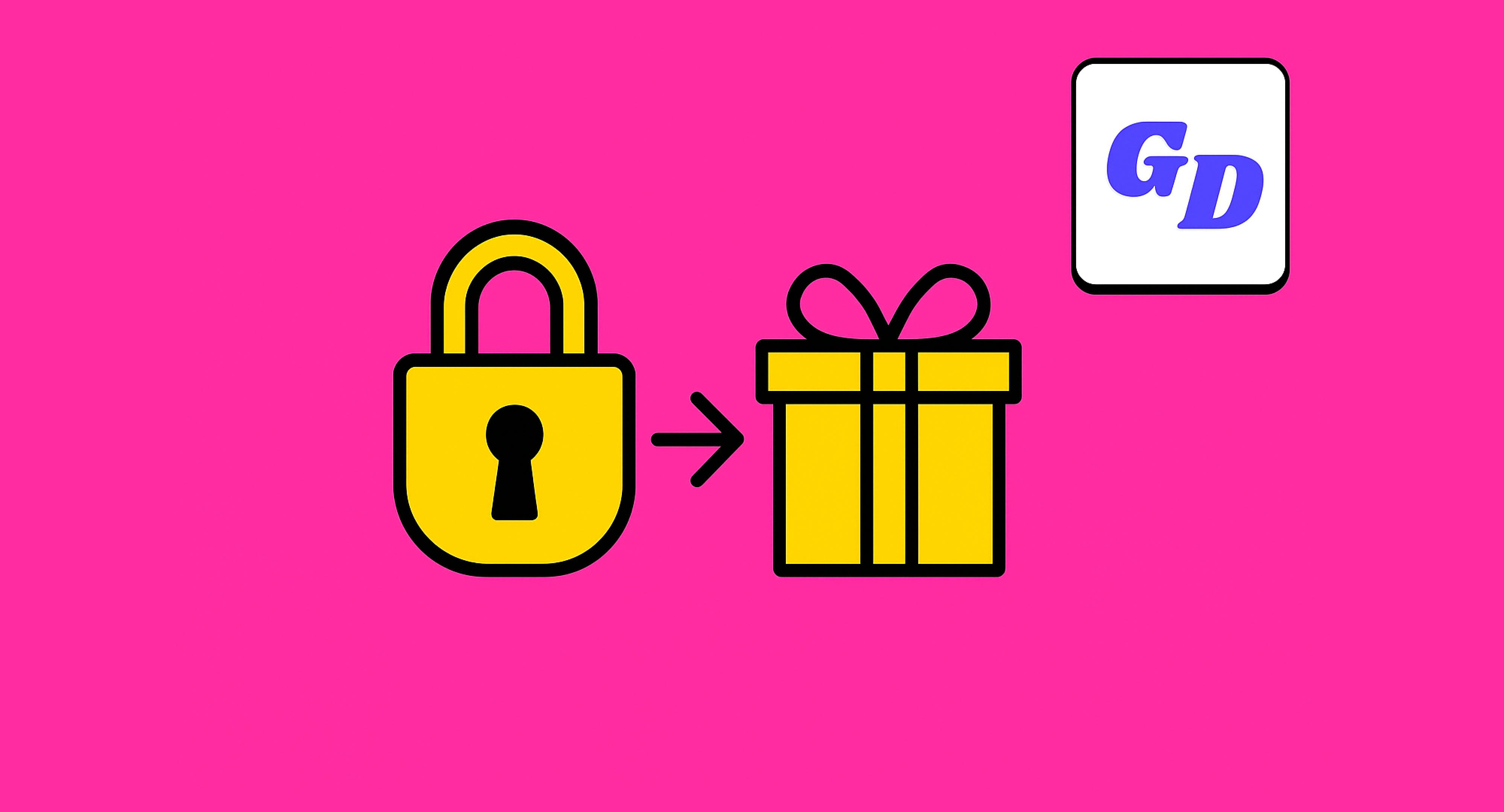
Grammarly shifted from making users feel locked out to making them feel gifted with value – a simple reframe that drove 20% growth in upgrade revenue.
August 2025
Dear Growth Designers 👋
I’m Shane Fontane, a product design leader who’s spent the last decade creating user experiences where business growth and trust go hand in hand.
At Grammarly, I led design across acquisition, onboarding, and monetization.
Today I want to walk you through a deceptively simple 5-step shift we made in our upgrade flow: reframing a lock as a gift.
So how did we hit 20% growth in incremental annual upgrade revenue? And hundred of thousands of new paid users?
Let’s get down to business,
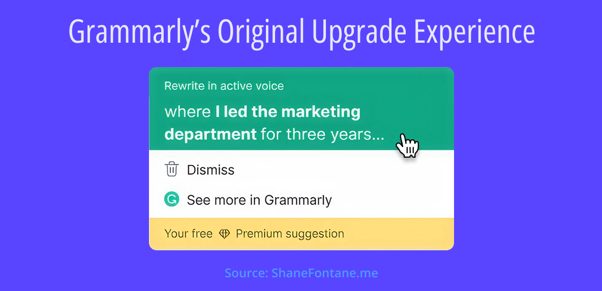
Grammarly’s original upgrade experience used a ‘Lock’ metaphor that Premium suggestions were locked and you needed to upgrade to ‘Unlock.’
The 5-Step Reframe
1. Teasing the Upgrade
Grammarly helps people write with more clarity and confidence across desktop, browser, and mobile.
Free users receive only a handful of Premium, AI-generated writing suggestions each day. Premium users can access features like plagiarism detection, unlimited personalized suggestions, and thousands of AI writing prompts.
To boost upgrade conversions, we brought monetization into the writing flow. Why? Because many free users didn’t fully understand the value of Grammarly Premium. Pricing pages and feature lists couldn’t bridge that gap, and prompts like emails or account upgrade flows often arrived at the wrong time.
We realized the best way to help free users understand and appreciate paid value was to let them experience it directly. Not in theory — in their own writing. We wanted them to feel a sense of ownership over the Premium experience before we asked them to upgrade.
So we rethought the funnel:
- A user begins writing a doc, email, or update.
- Grammarly offers both free and complimentary Premium suggestions.
- After a few, the remaining Premium suggestions are blurred out (a soft gate).
- The user is invited to upgrade.
- If they decline, they enter a 24-hour cooldown before new free suggestions appear.
This in-flow, value-first approach became one of Grammarly’s most effective growth levers — and is still live today.
2. Thinking Like a Gamer
Our team started investigating: which suggestion types would be more likely to lead to upgrades?
To push forward, I invited Naavik, a gaming consultancy, to run a hands-on workshop with our team. Their sessions focused on how play connects to motivation. They introduced us to core gamification components like rewards, level progression, exploration, skill mastery, and challenges.
The goal wasn’t to turn Grammarly into a game; it was to reframe how we thought about engagement, anticipation, and momentum.
Coming out of the workshop, the team proposed a concept internally dubbed Locked UI: Premium suggestions would be blurred, overlaid with lock icons, and visually positioned as inaccessible unless the user upgraded.
The intent was to create a sense of challenge and urgency—but it leaned too far into scarcity and loss aversion. And it triggered psychological reactance: when users feel restricted or controlled, they instinctively push back.
💡 The Locked UI came off as punitive, not playful—more like a warning than an invitation.
That’s when I stepped in and encouraged the team to rethink the metaphor. What if this moment wasn’t about what users couldn’t access—but what they’d already started to unlock? Could we shift from tension to curiosity? From restriction to reward?
3. Reframing the Lock as a Gift
That’s how the sticker peel was born—a playful, tactile interaction our Monetization team brought to life, where users could peel back a peek at what type of Premium suggestion might be underneath, but not fully reveal the content.
That partial reveal—while intriguing—also became the source of growing frustration. Users could sense there was value behind the sticker, but being unable to fully access it introduced tension. It walked a fine line between tease and trust.
This version shipped in 2024 and drove a significant bump in upgrades. On the surface, it looked like a win:
✅ Conversion rates climbed
📦 Users began hoarding their free Premium suggestions, treating them like valuable, limited rewards
But soon, user feedback began manifesting in more serious signals:
📉 An increase in uninstalls
📉 A downturn in weekly active users among our most engaged free cohorts
That was the red flag. While the experience was converting, it was also eroding trust. So I proposed a new direction: one that shifted from scarcity to generosity, from tension to transparency. We decided to make the suggestion visible, without blocking the entry point.
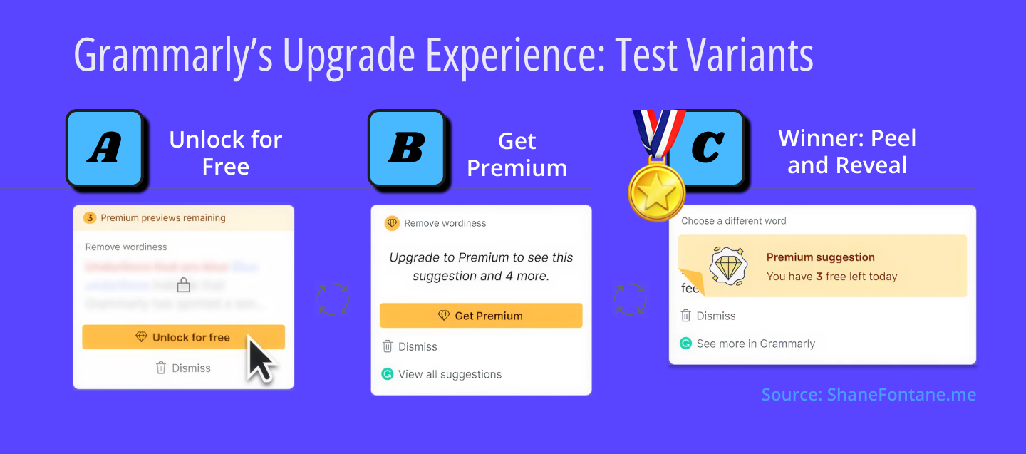
From Variant A's harsh “Unlock for Free” gate, to Variant B's premium positioning with “Get Premium,” to the winning Variant C's Peel and Reveal approach that celebrated what users had already unlocked. Tension transforms into curiosity!
4. Seeking Opportunities for Momentum
Two behavioral principles were key to this transformation:
🧠 Framing Effect
We reframed the upgrade from “you’re locked out” to “you’ve already unlocked value—here’s more.” This shift made the moment feel positive and earned.
💎 Endowment Effect
By showing users what they’d already received (free Premium suggestions), we created a sense of ownership. Upgrading felt like continuing a valuable experience (versus starting over).
Together, these principles helped turn a conversion moment into a moment of momentum.

And the winner is… By celebrating each free Premium suggestion users receive, and framing the upgrade as unlocking “more”, Grammarly saw 22% more upgrades and 4% more annual plan purchases.
5. Choosing Integrity Over Manipulation
Early in the funnel, we leaned on goal gradient theory: the more suggestions a user accepted, the more invested they felt. When they hit their limit, we initially leaned on loss aversion to drive the upgrade. But users pushed back. Some even felt tricked.
So we softened the experience, increased transparency, and brought the value forward. The outcome? A smoother, more user-respecting path to conversion.
By 2024, these UX and narrative shifts contributed to:
- 20%+ growth in incremental annual upgrade revenue
- Hundreds of thousands of new paid users through in-product upgrades
Conclusion
Paywalls often feel like traps. But when designed with empathy and clarity, they can feel like encouragement.
At Grammarly, we learned that you don’t need to trick users into upgrading. You just need to help them feel the value—by experiencing it in their own flow. When you frame the moment as a gift, not a gate, users are more likely to say yes.
So next time you're designing an upgrade experience, ask:
What would this moment feel like if it were a gift?
And how can we wrap it so users want to open it?
About the Author
Shane Fontane is a product design leader who helps companies scale impact though thoughtful user-centric design practices. He built and led growth design at Grammarly for 5 years across acquisition, activation and monetization. Shane’s known for high craft, systems thinking, and infusing growth with humanity. You can reach out to him in the GrowthDesigners.co Slack community, or on LinkedIn.
