
Frigade Product Tours

April 2025
Dear Growth Designers 👋
Few elements are as controversial as product tours in the world of growth design. When done poorly, they're the bane of users' existence – interrupting workflows and stating the obvious. But when executed thoughtfully, they’re powerful tools.
At Frigade, our team has analyzed hundreds of onboarding flows and helped our customers build countless more. We document industry trends and best practices at productonboarding.com, so you don’t have to. Today, we're gonna break down how to build the good kind of product tours.
Alright, let’s dive in!
Eric Brownrout
Co-Founder and CEO of Frigade AI
Why Most Product Tours Fail (And How to Make Yours Succeed)
Let's face it – product tours have earned a bad reputation. We've all been that user: you log into an app to quickly complete a task, only to be bombarded with tooltips pointing out obvious UI elements, forcing you into a frustrating game of "close the pop-up" before you can actually use the product.
But as growth designers, we have the power to change this narrative. Companies like Notion, Slack, and Figma prove that well-designed product tours can significantly boost customer success and activation rates.
The Right Use Cases for Product Tours
Before designing a tour, consider if it's the right solution for your specific need:
- New Feature Launches – Introduce users to new functionality, showing what it does, where to find it, and how to set it up.
- New User Onboarding – Welcome first-time users and help them navigate your product, highlighting the essential areas they should focus on first.
- Feature Upsells – After a user engages with a basic feature, showcase how premium capabilities can enhance their experience (perfect for driving conversions).
- Help Center Hub – Provide guided tours for users who are actively seeking assistance with complex workflows.
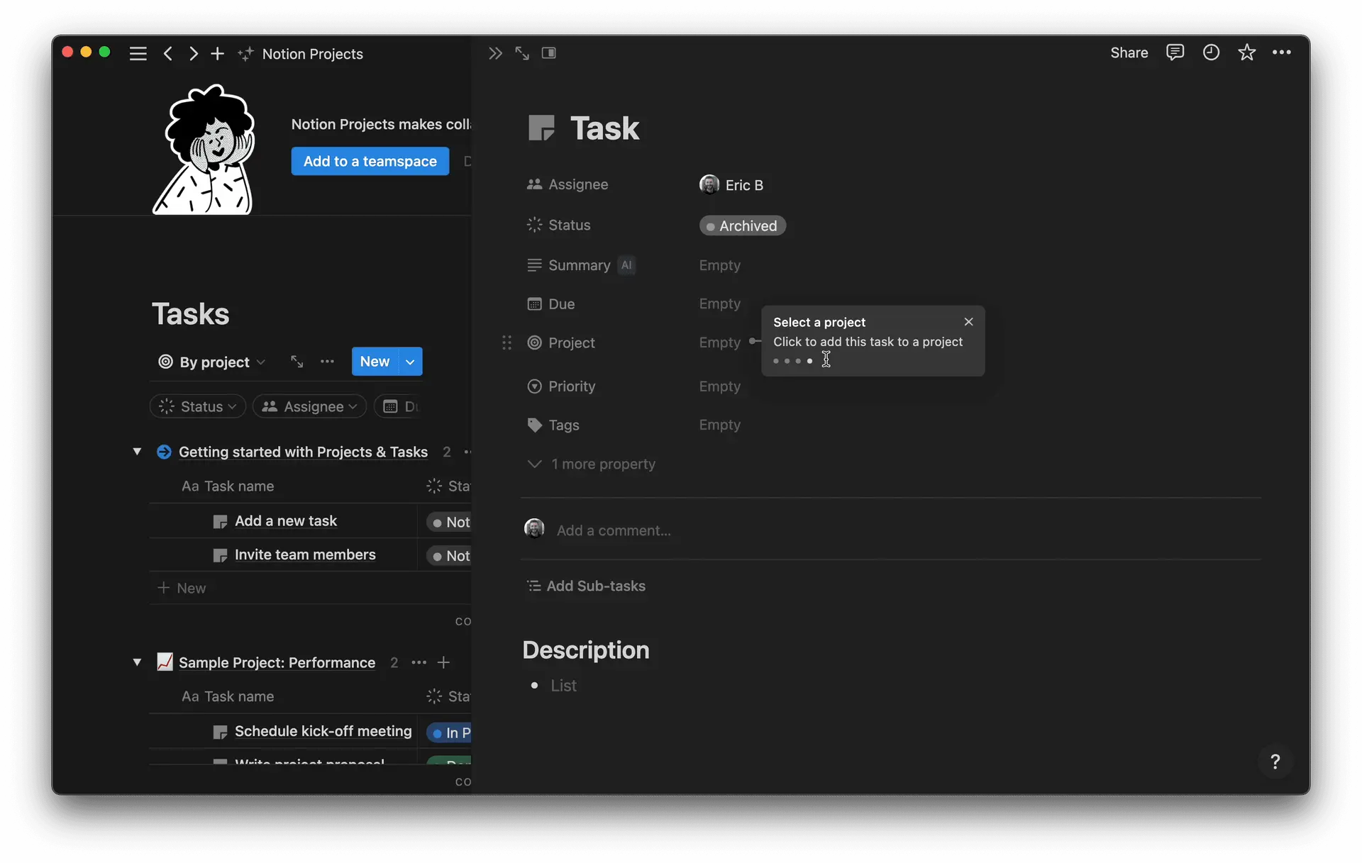
Notion’s first time user experience shows subtle tour callouts
Design Principles for Tours That Users Actually Complete
1. Make Tours Opt-In
Users engage more when they choose to participate. Instead of forcing tours on everyone, offer them through:
- Onboarding checklists
- Product announcement banners
- Inline cards
- Help center resources
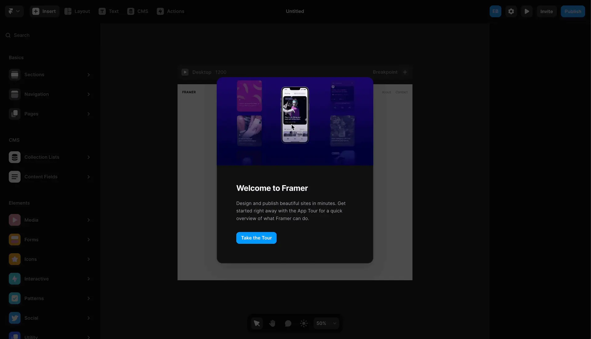
Framer’s first time user experience allows for opt in
2. Keep Them Concise
Avoid the temptation to create 16 step tours explaining every button in your app. Focus on critical functionality that delivers immediate value.
3. Design for Action, Not Observation
Replace obvious statements like, "this is the dashboard," with interactive steps that encourage users to try features themselves. Slack's approach of letting users choose their theme directly from within the tour is an excellent example of this principle in action.
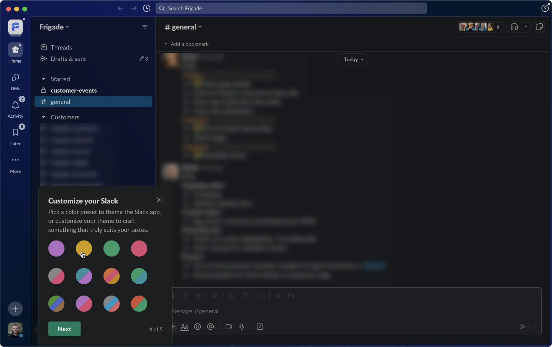
Slack allows user to see customization in real time
4. Always Make Tours Dismissible
Users' needs vary, and sometimes your tour won't match what they're trying to accomplish. Always provide clear exit options and be extremely cautious about creating mandatory tours.
5. Create Re-Launchable Experiences
Build a hub where users can access specific tours when they're actually ready to learn. Brex does this well with their help center hub that allows users to launch tours on demand.
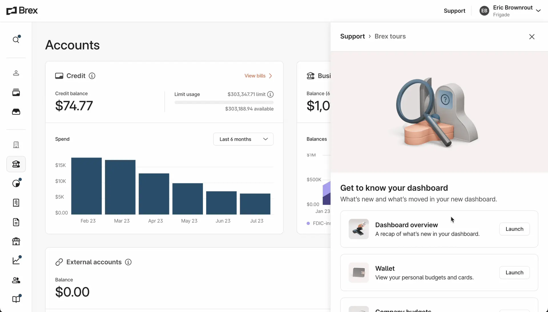
Brex has a help center hub with re-launchable tours
6. Offer Snooze Options
For proactive tours (especially those not explicitly requested by the user), include a snooze function that allows busy users to engage later when they have time.
Product Hints: The Subtle Alternative to Tours
Sometimes, a full product tour isn't what your situation calls for. Enter product hints – a tour’s less obtrusive sibling.
Like tours, hints anchor to specific UI elements, but they're closed by default and can typically be explored in any order. Subtle animations draw attention without disrupting the user's workflow (we opt for pulsing dots in Frigade).
Use hints when you want to:
- Alert users to minor UI changes ("This feature has moved here")
- Highlight small product improvements without interrupting workflow
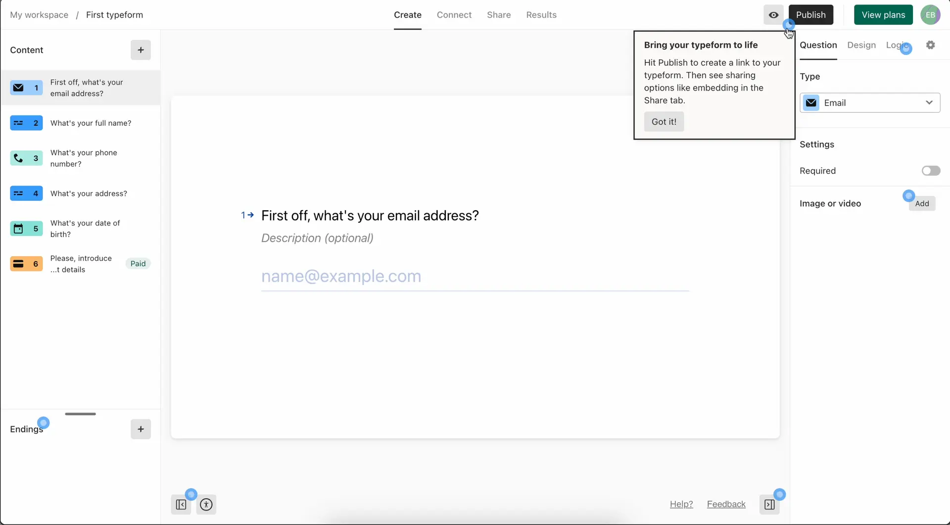
- Provide optional education for new users (as exemplified by Typeform's approach)
Growth Designer's Implementation Checklist
As you design your next product tour or hint, here’s a cheatsheet to run through:
- Have I identified a specific, appropriate use case for tours?
- Is my tour opt-in rather than forced?
- Have I kept the number of steps minimal (ideally 3-5)?
- Do the steps encourage action rather than passive reading?
- Are there clear options to dismiss, snooze, or relaunch?
- Have I considered if hints might be more appropriate than a full tour?
- Does the design enhance rather than obstruct the core user experience?
- Have I included a way to measure completion and engagement?
Conclusion
Remember, the best product tours aren't about showing users around – they're about helping users accomplish meaningful tasks that demonstrate your product's value.
This is easier said than done. That’s one of the reasons we recently launched Frigade AI. Frigade AI dynamically generates step-by-step tours for your users to make them more successful. You can’t anticipate and plan for every users’ need ahead of time, and Frigade AI adds a layer of personalization while also eliminating the tedious process of manually building tours.
Best of luck out there, and don’t hesitate to reach out if there’s any way our team can help.
About the Author
Eric Brownrout is a co-founder and CEO of Frigade AI, a startup that provides an intelligent in-app assistant designed to guide and onboard users through software products. Before founding Frigade, Eric worked on the growth team at LinkedIn.
